Choosing the right colours for your Small Business
As a small business, one of the most important things you can do is create your brand and packaging imagery. It’s what sets your business apart from others in the market and is the first impression your target customers get when they see your product. 85% of consumers believe that colour is one of the biggest motivators when choosing a particular product, and 92% believe that visual appearance is the most important factor overall when selecting a new product.
So, how do you make this work for you and your business? Our design experts at Avery have put together their top tips to use the right colours in your branding and packaging to make your customers fall in love at first sight.
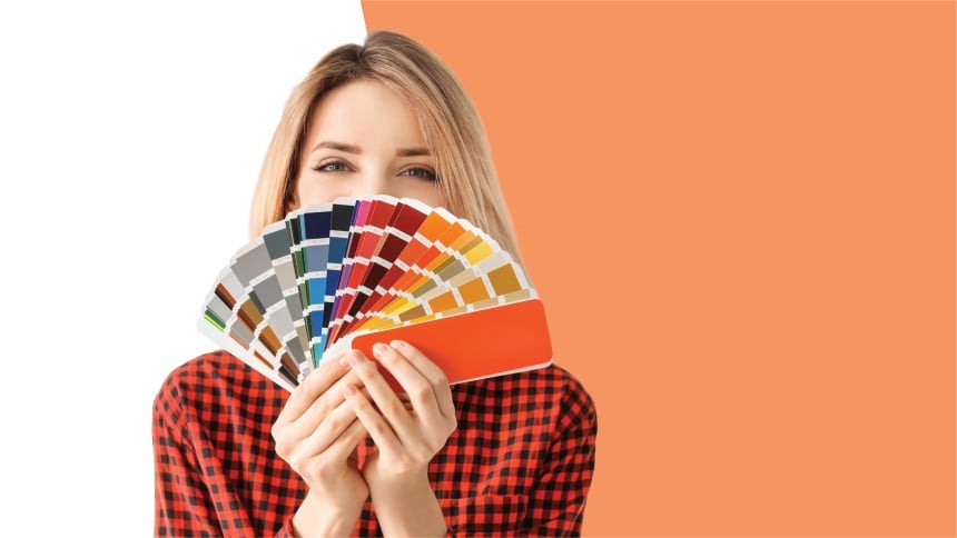
Tip #1: Find the right balance
Balance is always important and is essential in colour and great design. Too many colours can make it hard to achieve that right level of balance, the best way to combat this is to use the colour wheel. A colour wheel is a great way to visualise the effect of using a monochromatic (one colour family) palette, or a combination of different colours – below we have put together some examples of how you can use the colour wheel to choose the right palette for your brand.
Monochromatic colour
Uses different values of the same colour hue. Harmonious and visually cohesive, using monochromatic colour helps to associate your brand with a specific or memorable colour. It doesn’t draw attention to itself but rather lets the brand speak for itself. It makes the job of designing easier and faster as you don’t need to stress over picking colours or making sure they go together.
Examples: Oreo, Animal Planet, PayPal, Cadbury.
Complementary Colours
Uses two colours directly opposite each other on the colour wheel. Works best when one high contrast colour is used as the predominate colour with the other colour as an accent. A good general rule of thumb is 80/20, this gives a good level of ‘visual shock’ without overdoing it. Think colour combos like orange and blue, red and green or yellow and purple.
Examples: Fanta, Hallmark, Mountain Dew, LA Lakers.
Analogous Colours
Uses three or more colours that are adjacent to each other on the colour wheel. They generally focus on one more dominant colour and a supporting secondary colour, with a third that would generally be either a mix of the first 2 colours or a bright accent colour. Like the complementary colour scheme, there is a general rule for an analogous colour scheme, 60/30/10. Analogous colour is one of the easiest and most eye-catching ways to work colour into a design. It makes a big impact that is brighter and more fun than a traditional neutral palette.
Examples: Mastercard, Slack, Instagram, BP.
Triad
Uses three colours that are evenly spaced around the colour wheel to form a triangle. Think colour combos like Red, Yellow and Blue or Purple, Green and Orange. Triad colour schemes create similar feelings to complementary colours, but with more shades, providing more options for other aspects in design. It is generally used to create cheery and happy emotions. It is trickier to pull off and if used incorrectly can be potentially brand-damaging but is extremely effective if used correctly.
Examples: Hungry Jacks, Firefox, Tide.
Whatever colour scheme you decide on, try using variations of your brand colours or scheme to represent different products or options, while keeping your style consistent. This can be extremely effective for things like different flavours, scents or other special features to differentiate yourself from your competition.
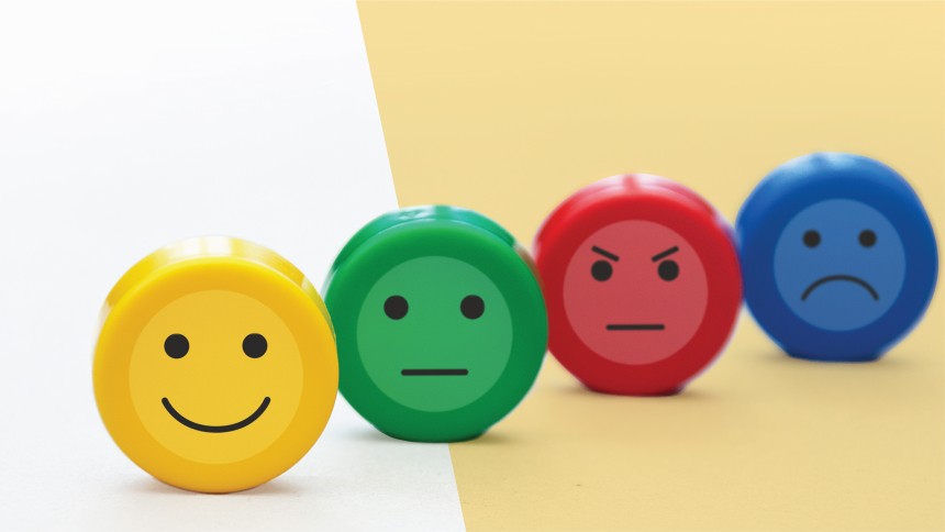
Tip #2: Create an emotional response
Colour psychology is a large part of design and marketing as a whole. It breaks apart what colours naturally and have been trained to evoke different emotions in us. It can create a powerful impression on consumers and tell them what your brand is all about. Below are some common colour perceptions to consider when designing your brand image and packaging.
Red: Confident, Strong, Bold | Orange: Energetic, Youthful, Friendly | Yellow: Happy, Friendly, Clarity | Green: Health, Freshness, Growth | Blue: Calm, Trustworthy, Dependable | Purple: Royal, Luxurious, Creative | Black: Powerful, Sophisticated, Power | White: Pure, Minimalistic, Calm | Brown: Masculine, Serious, Rugged | Grey: Practical, Stable, Balanced | Pink: Feminine, Romantic, Compassionate
Tip #3: Know your competition and test how your brand colours compare
There are many external factors that can impact your chosen colour Palette. Things like the material you choose to print on, the varnish or laminate you select and also the quality of materials and print you use. The colour you choose can also be impacted by what can actually physically be printed, as our computers and eyes can see a lot more colours than we can print using traditional printing methods. It never hurts to ask your printer for their opinion or even a sample before diving in on a new colour choice, just to be sure that it will come out looking how you expect!
Do you know what your product marketplace looks like? Do some research, check out your competition and consider these factors:
Display: How will your product be displayed—on a shelf or table, or in a bin? Make sure the colours and design of your product label will be clearly visible from any angle.
Differentiation: Use colours that make your product label and packaging stand out from the rest of the pack.
Niche: Spotlight what makes your product unique on the label with a bright bold call-out.
Trends: Showcase with varied colours what your product does to meet the current needs or trends.
Being flexible and being able to update colours or create new product labels online, makes it simple to always keep your packaging up to date and on-trend. When you’ve finally decided on a few colour options, test them out. Create your label design with different colours, making sure the text on the label is easy to read. Then, simply order a couple of sheets of each label and mock-up your products. Test the variations family, friends, neighbors and consumers to get their feedback. Then fine-tune your design until you get the right colours that will appeal to your target consumer.
If you have any other questions, feel free to call the helpful Avery Customer Care Center at 1800 644 353