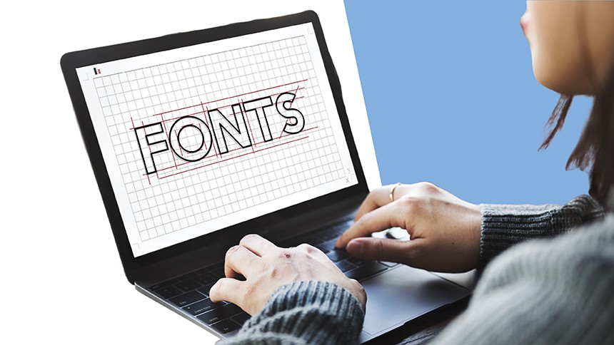
Choosing the Right Font for Your Branding: 12 easy to read fonts
If you’re in the branding stage of your business you might have just found out about the importance of easy to read fonts. While it might be tempting to choose a fancy cursive font to use in your branding, if your customers can’t read your copy they’ll be less likely to take the action you want.
Your customers need to be able to read your business messages clearly and easily. Which is why choosing the right easy to read font is super important. But how do you choose the best easy to read fonts for your business? With so many different fonts to choose from, this process can quickly become difficult.
But don’t worry, Avery has got you covered. In this article, we’ll take you through 12 easy to read fonts to use on all your marketing materials. Let’s get to it.
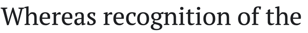
Georgia
Georgia is one of those classic easy to read fonts - and for good reason. It’s a serif font, which means that each letter has what I like to call ‘little feet’. Sans serif, on the other hand, are fonts that don’t have any feet. Even though many people prefer sans serif fonts for their ease of readability (especially on websites), Georgia is still a great choice and an easy to read font. It’s perfect for businesses with a slightly more upmarket feel to their branding. According to Microsoft, ‘Georgia exudes a sense of friendliness, a feeling of intimacy that many would argue has been eroded from Times New Roman through overuse.’
Here’s what Georgia looks like:
Helvetica
Arguably one of the most easy to read fonts available today is Helvetica. It’s easily one of the most popular sans serif fonts (no feet) and frequently billed as the most readable font on the web. When it comes to printed marketing materials though, we recommend going with a serif font like Georgia. Save helvetica for your website or other online marketing.
Here’s what helvetica looks like:

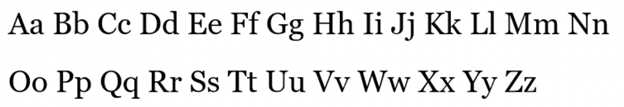
PT Sans & PT Serif
Ok now that you know the difference between serif fonts and sans serif fonts, you might be struggling to decide which is the best easy to read font? The Paratype font offers both options, so that you can see the difference more easily or perhaps even use a combination of both.
Here’s what PT Sans looks like:
And PT Serif:
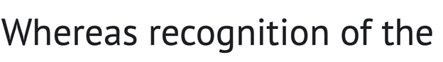
Open Sans
Another popular sans serif font is Open Sans. This easy to read font is optimized for use in printed materials, on websites and on mobile interfaces, making it an excellent all round choice for many businesses. Part of its popularity is due to the amount of space between characters (referred to as ‘kerning’).
Here’s what Open Sans looks like:

Quicksand
Need to choose an easy to read font that looks great on mobile too? Quicksand could be the font for you! This is particularly important if you run an ecommerce store, as many people these days shop on their phones. Quicksand is another sans serif font offered by Google, and it’s optimized for use on small screens. According to Google, Quicksand was ‘built on a foundation of geometric shapes to give the impression of friendliness.’ Another friendly font!
Here’s what Quicksand looks like:

Verdana
What about good old Verdana? Verdana is a classic font choice and is widely considered one of the easy to read fonts. Verdana is a great choice if you have large blocks of text that you need printed, as most people typically agree that this font is very easy to read. Another sans serif choice that’s great to use on both printed materials and online.
Here’s what Verdana looks like:
Rooney
Are you looking for an easy to read font with a little more personality? Then Rooney could be the font for you! If your brand personality takes a more unconventional and lighthearted approach, this could be a great font to use in your marketing materials. According to Jan Fromm, Rooney’s creator, the idea is that this font leaves an overall impression of warmth and smoothness, achieved through rounded shapes and soft curves.
Here’s what Rooney looks like:
Karla
Maybe you’re looking for a non-nonsense sans serif font that’s easy to read and keeps things simple. If so, Karla could be the font for you. This popular typeface is perfect for businesses and brands that take a unique and fun-loving approach to branding.
This is what Karla looks like:

Roboto
But what If your brand is bolder and edgier? If you’re looking for easy to read fonts that pack some punch, Roboto could be the perfect font for you. According to Google, this font is ‘modern yet approachable’ perfect for brands that want to stand out for all the right reasons.
Check out Roboto here:

Futura
Another thing to consider when choosing an easy to read font is the tone in your writing. Is your brand tone more serious or casual? A great font that can be used in either scenario is Futura. It’s a clean, easy to read font that packs a punch.
Here’s what it looks like:

Ubuntu
Ubuntu is another fun easy to read font with a distinctive edge. Ubuntu is a South African word meaning humanity, and this font certainly lives up to its name. Referencing calligraphy and the way people write by hand, Ubuntu is one humanist-style font worth checking out.
Here’s what Ubuntu looks like:

Lato
Is your business branding a little more on the serious and professional side? Then Lato could be the perfect easy to read font for you. The Lato font features semi-rounded details in its letters, promoting a feeling of warmth, while the strong structure provides more seriousness and stability. Perfect for brands who are serious but still want to come across approachable.
Here’s what Lato looks like:

Find the perfect easy to read fonts with Avery WePrint
Whether you’re wanting to design custom labels for your business, postcards, or business cards, Avery has got you covered. Explore our range of business marketing materials and start designing with our easy to use software today.