How To Create a Font Pairing for your Brand
Wondering what the secret is to pairing fonts? By pairing fonts together thoughtfully, you can create more aesthetically pleasing designs for your brand.
Whether you're designing a new custom label for your products, or if you’re looking to design a new business card on Avery WePrint, font pairing is something to take into consideration.
But the good news is, you don’t have to be a graphic designer to develop your eye for font pairing. This isn’t rocket science, and even if you’re a non-designer you can still create beautiful designs with the help of our Avery WePrint software.
In this article, we’ll be sharing some simple tips to help you when pairing fonts so that you can create unique designs that are visually beautiful and stand out from your competitors.
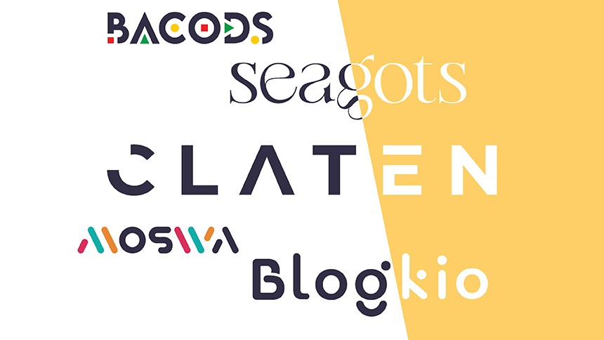
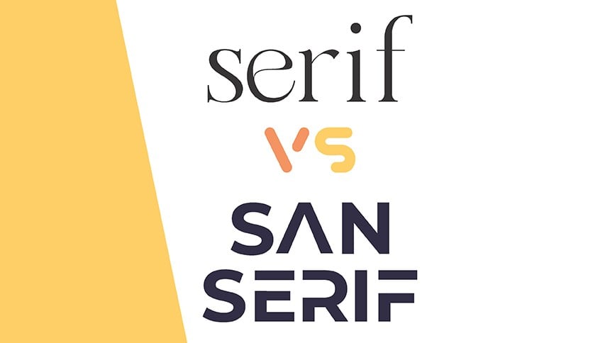
With feet or without? In other words, serif or sans serif?
Now what the heck does that mean you ask? Well, when pairing fonts the first thing you need to decide is if you want your font to have feet (serif) or no feet (sans serif). This font for example (Arial) is sans serif. Times New Roman, on the other hand, is a serif font.
So why does it matter? Some fonts have what we call ‘font families’ that include both serif and sans serif versions of the same font. These can look good when pairing fonts, if you place them together correctly. However, generally it’s not advised to pair a serif font with a sans serif font unless they come from the same font family.
Consider font hierarchy
The different levels of your font hierarchy will determine when a different font or font weight should be used.
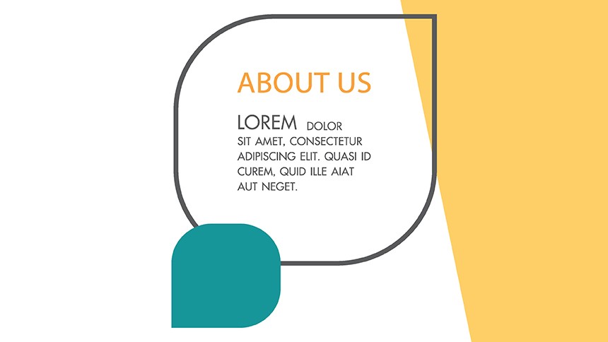
Let’s take a look at this example from Avery WePrint. This font pairing has a hierarchy that includes the font size, the space between the letters, as well as the height and weight of the font. In this particular design template, there are three different levels of hierarchy and two different fonts used.
The words ‘Your logo’ represent the top of the hierarchy. The text is large, bold and designed to draw your eye. The words ‘Place’ and ‘Here’ are second on the hierarchy and feature more space between the letters and a smaller font. Finally, ‘Place Text Here’ is the third level on the hierarchy and features a different font that isn’t bolded, this part is designed to be read last.
Consider the font families or typeface
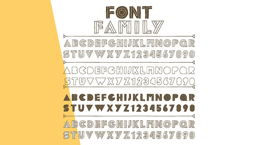
A typeface is simply a grouping of fonts; otherwise known as a font family. For example, Arial, Arial Black, Arial Narrow, and Arial Rounded are all part of the same typeface or font family.
When font pairing, it’s important not to use more than 2-3 fonts in a single design. If you do, your design will likely end up looking messy and cluttered. By using fonts in the same family, you can create more visually appealing designs in the Avery WePrint software.
Consider the mood when font pairing
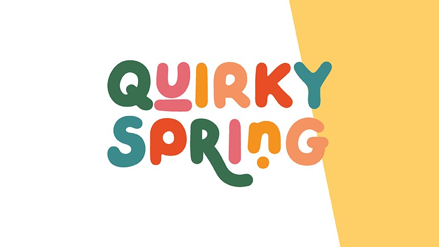
I know, I know. What does the ‘mood’ even mean? Well that comes down to your brand. Is your brand fun, serious, retro, bold, clean, or feminine? These are all moods that influence your font pairing choice.
For instance, let’s say you run a store that exclusively stocks retro 50’s fashion for women. In that case, the mood you would be going for would be ‘retro’ and you might like to consider some classic or vintage fonts for your font pairing. You probably wouldn’t go for something like the ‘Bubblegum’ font which is more suitable for a children’s brand.
The bottom line is, fonts have a personality and style so you want to make sure that your font pairing suits the mood and personality of your business and brand.
Create contrast with your font pairing
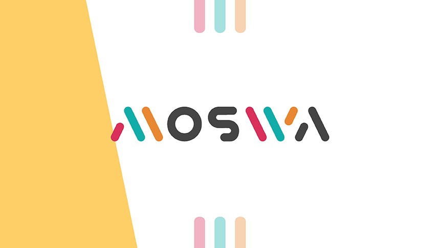
Here’s the thing: you want enough contrast in your font pairing to be aesthetically pleasing, but you don’t want so much contrast that the design looks wacky. Similarly you don’t want too little contrast as this makes for a boring design. It’s all about striking the right balance.
As we’ve already mentioned earlier in the article, creating the right amount of contrast comes down to choosing fonts from the same family. The weight and size of the font helps to create a nice amount of contrast too.
For example, you might try font pairing Montserrat bold with Montserrat light. Another font pairing to consider is pairing a bold block font with a cursive script font. This creates a high amount of contrast but still looks good provided that you’ve selected fonts with the same mood and personality.
Once you’ve found your winning combo, stay consistent
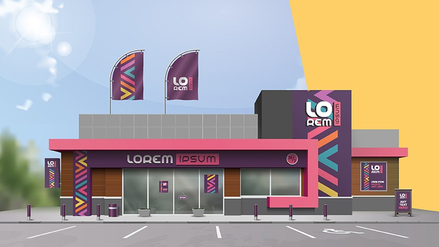
Landing on the perfect font pairing can take a little time, but once you’ve found the right combination of fonts, you can use them time and time again in all your marketing materials.
You then will have a guide that will help you create all your future designs. By staying consistent with your font pairings, you will also help to build brand recognition which is super important for your business.
When in doubt; check out sites like Pinterest for more inspiration. You can look up brand boards, colour palettes and creative font pairings. This can help you to more efficiently figure out what you like and what you don’t like when it comes to design and font pairings.
Check out Avery WePrint software
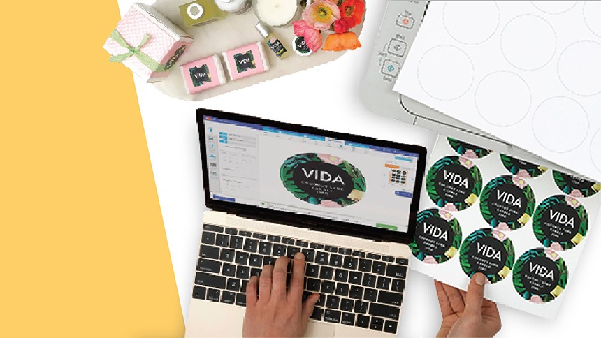
If you’re looking into designing custom labels and stickers for your business, look no further than Avery WePrint. With our software you can create your own designs from scratch, or use one of our design templates and get customising.
Once you’ve created the perfect design, it’s simply a matter of placing your order and we’ll do the rest!